Devlog #08 - Updating Systems
Hello Everyone! We are back with our weekly progress report. Let’s take a look at what we did this week.
Programming
This week we spent most of our time adding the final powerups we planned and improved on the block movement, player feedback and other smaller things that are important for the overal experience.
Let’s start with the powerups.
The one that seemed the most difficult one to implement was the sticky powerup, so we started with that. Our suspicion turned out to be true until we figured out we could simply use the collision system to our advantage to “bind” other blocks to the sticky block.
The powerup with the ability to invert the controls was actually harder than it looked at first glance, as players out of turn should not be affected by this. After some small changes to the controls code, we got this working.
Last, but not least, let’s take a look at the Wind powerup. It was relatively easy to get this one to work, but balancing it was a bit harder, as you don’t want the whole tower flying away with a single gust of wind. After spending some time tweaking the values, we have wind that’s noticeable, but shouldn’t ruin the tower. Though, we might go back later and tweak those values again.
For the block movement, we reworked a bit of our code to make the blocks move more naturally, as it was very easy last time to get blocks stuck in other blocks and let the physics system have a field day.
The last major thing we did was improving the player feedback. We added some sounds when you pick up a block and let go of it, when you activate a powerup and whenever you drop a block. You will also be notified when you can jump in and put a powerup on someone. As described further below in the art part, you can now interact with the background elements as well, which can be used to distract a friend while they are placing a block.
Art
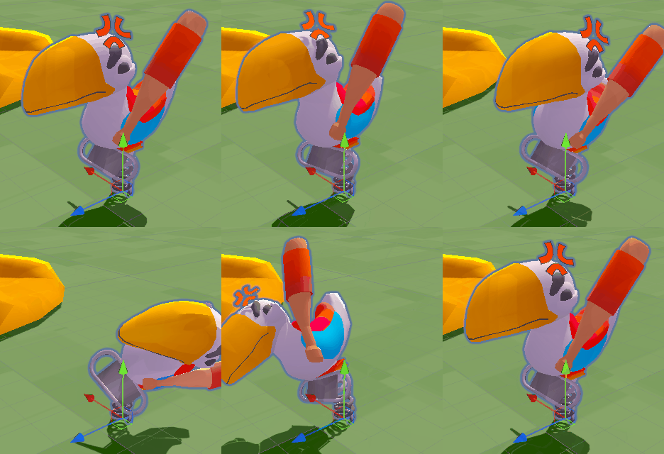
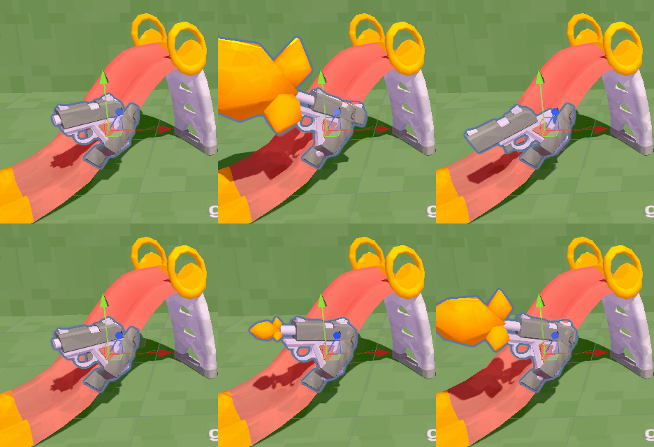
In our further attempt to make the game feel more competitive, weve been leaning into a more chaotic aesthetic. For this, we are moving towards background actions that weigh into this. The slide is now armed and dangerous, and you can take out all of your anger on the toucan swing:
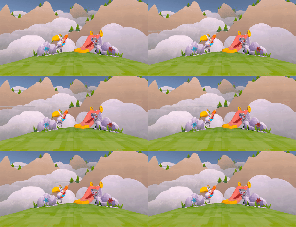
A different look at how we are breathing more life into the scene is how we have now introduced a slight sway on the clouds, to get some moving pixels into the frame. Expect more of this in the next week!
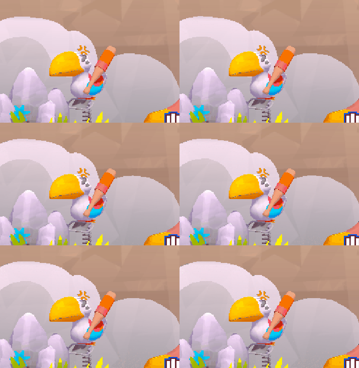
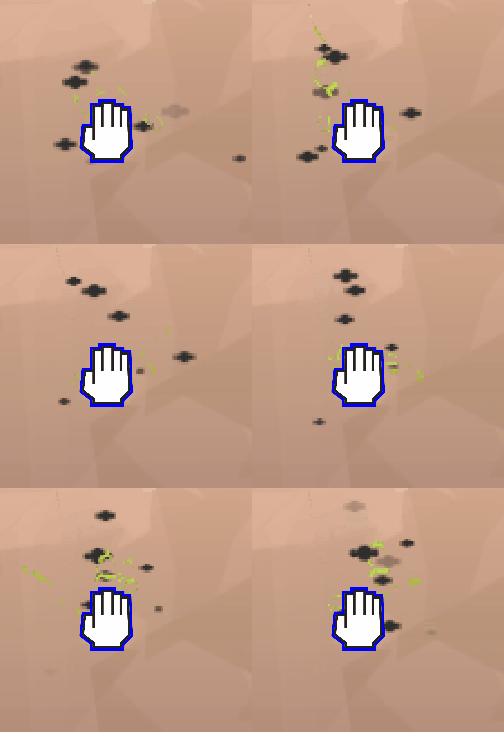
Following our supervisor's feedback of last week, we have taken a step back to identify clarity issues and improve on this exact matter. In particular, we have taken a second look at the pixelation factor and made the game less pixelated, so that there is more room to make minute movements, while still retaining a pixel-y charm. We have also undergone a second art pass on the smelly hand vfx to make it more visible ingame. Clarity, clarity, clarity!
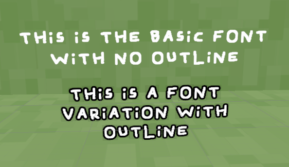
We also started integrating the final font style Tower Tricksters will be leaning on. It’s a handwritten custom font from one of the team members, so no need to worry about any rights’ infringement. The font should support the cartoony and silly identity of the game with its cartoonish, chicken scratchy-feel.
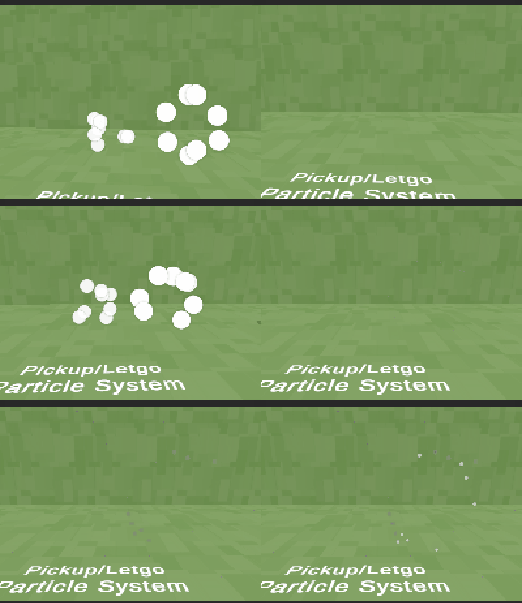
We are building more player feedback to make sure the visuals of the game support and guide the players’ action to the utmost degree. For this sprint, this is particularly visible in the new pickup/letgo particle systems, that play around the player’s cursor when they either pick up or let go of a block. These are by now means the fanciest or best looking VFX systems (we tried some of those too), but doing anything more than a barebones movement proved to be way too noisy, and did nothing more than muddle up the clarity of the game loop. So in the end, the simplest of systems was the winner!
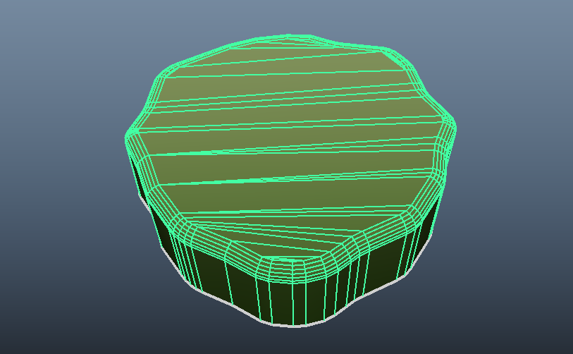
This week we changed the ground plane so that it isn't any more a simple rect with a straight line. It has some variation now, during the creation of the ground plane we kept the outline very simple and not too noisy. We added a nice noise texture to the ground plane for some color variation.

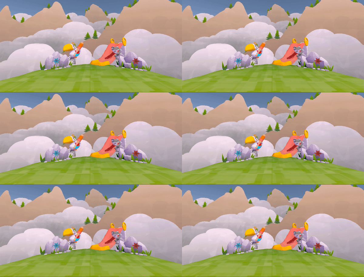
We added an animated fog particle effect to the scene with an animated spritesheet in the particle effect to add some variation in the scene, we decided to keep the fog with a low opacity for a subtle effect.
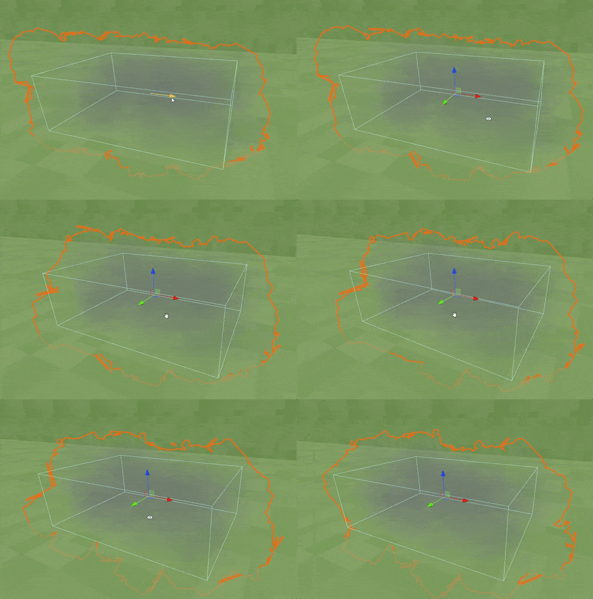
Here is an example of how the fog particle effect is integrated into the scene.
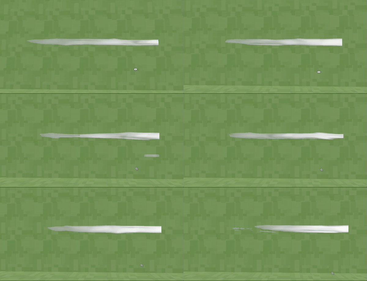
We changed the wind particle effect that we made the previous week to add an animated shader to the material so that the wind particle look more interesting to watch instead of a static texture.
In the coming week, we will be finalizing the UI, so we can finally throw out the developer art menu! See you then!
Files
Get Tower Tricksters
Tower Tricksters
Mess with your friends in this colorful couch-PVP game! 1-4 players
| Status | In development |
| Authors | Mikkel Blaase, Jonathan Menschaert, samynjonas, Veehos, JohanPindeville |
| Languages | English |
More posts
- Devlog #11 - Finalizing ProjectMay 30, 2023
- Devlog #10 - PolishMay 22, 2023
- Devlog #09 - Feature FreezeMay 15, 2023
- Devlog #07 - Adding UIMay 01, 2023
- Devlog #06 - Powering upApr 25, 2023
- Devlog #05 - In ProductionApr 17, 2023
- Devlog #04 - Starting ProductionMar 27, 2023
- Devlog #03 - Finalizing PrototypeMar 20, 2023
- Devlog #02 - Project PrototypingMar 13, 2023
Leave a comment
Log in with itch.io to leave a comment.