Devlog #11 - Finalizing Project
Hello everyone!
The time has come for our final devlog. We have worked tirelessly the past week to finish the last features for the final build. Let’s dive into this week’s progress immediately!
Programming
The programmers spent a long time this week weeding out the bugs, and adding a lot of new polish features.
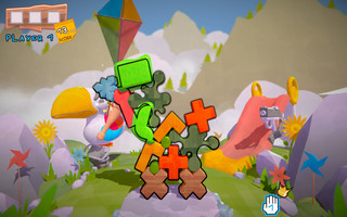
A particularly nasty bug we encountered was one where the points for dropping a block were mistakenly subtracted from the next player in line. However, the “fix” for this issue caused both players to lose the points. After spending some time identifying the cause and rewriting some code, we managed to fix this issue.
But there was another, another glitch with the points. When reaching the first goal it could happen, not always, but it could that you kinda euhm would get infinite points… and I know how that sounds, “That isn't a glitch, I am just better” and well you're wrong it's was a glitch and we fixed it, so good luck getting over 100 points now. For those wondering, this was the result of the bug, it was bad…

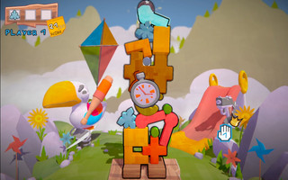
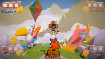
We got the feedback it is not always clear when someone is in turn, so we added a ton of player feedback to make it clearer. We matched the colors from the cursors to the player, this includes the player hud and the messages. Furthermore, we also added the player number on the cursor to fully connect the cursor to the information on the UI. You also now get feedback on the amount of points you have gained or lost.
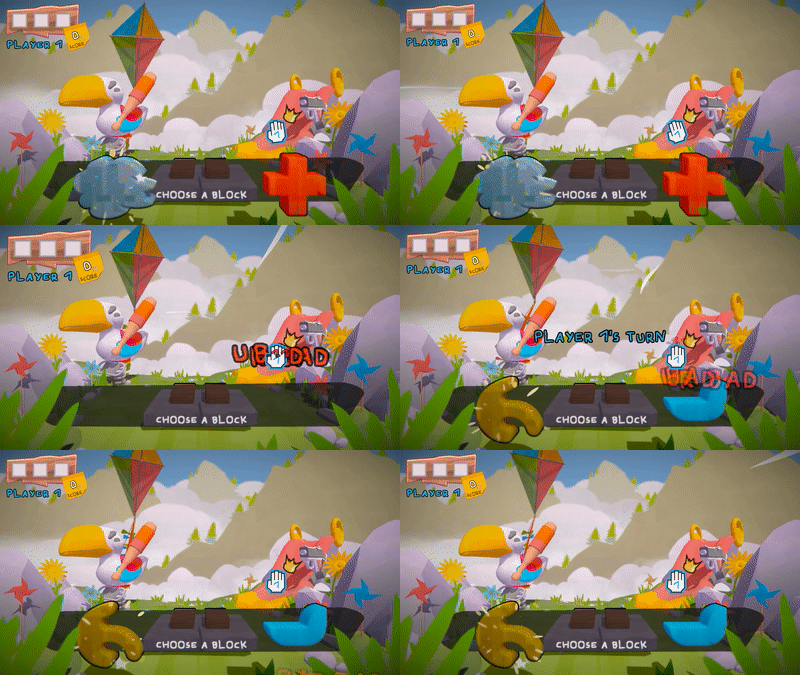
Another aspect we improved on is the powerup achieving and activating. Now when you achieve a powerup, instead of appearing in the middle of the screen, it originates from the location of the block in the tower, making it more clear where the powerup comes from.
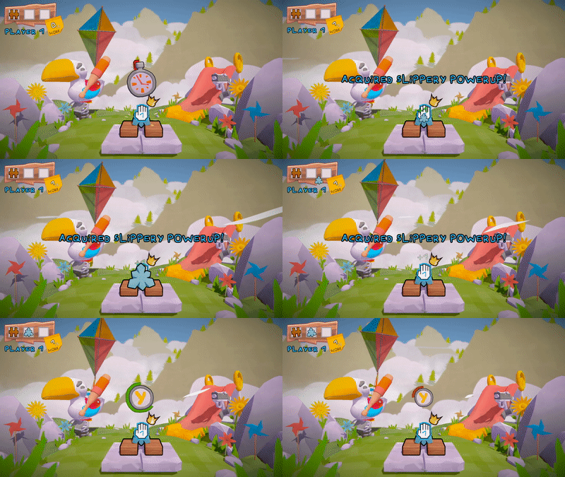
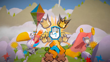
When activating the powerup, the powerup no longer activates instantly, there is a short animation that indicates the powerup was activated followed by a sound cue. If the powerup has a visible effect on the world, this is also when the visuals are introduced.
Art
The final devlog. And the final art update we get to post. And what a journey it has been. For the final stretch we got some killer feedback, and we have been excitedly scrambling to apply it before the finish line, in a safe, controlled and NOT haphazard way of course.
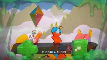
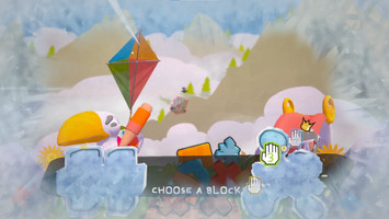
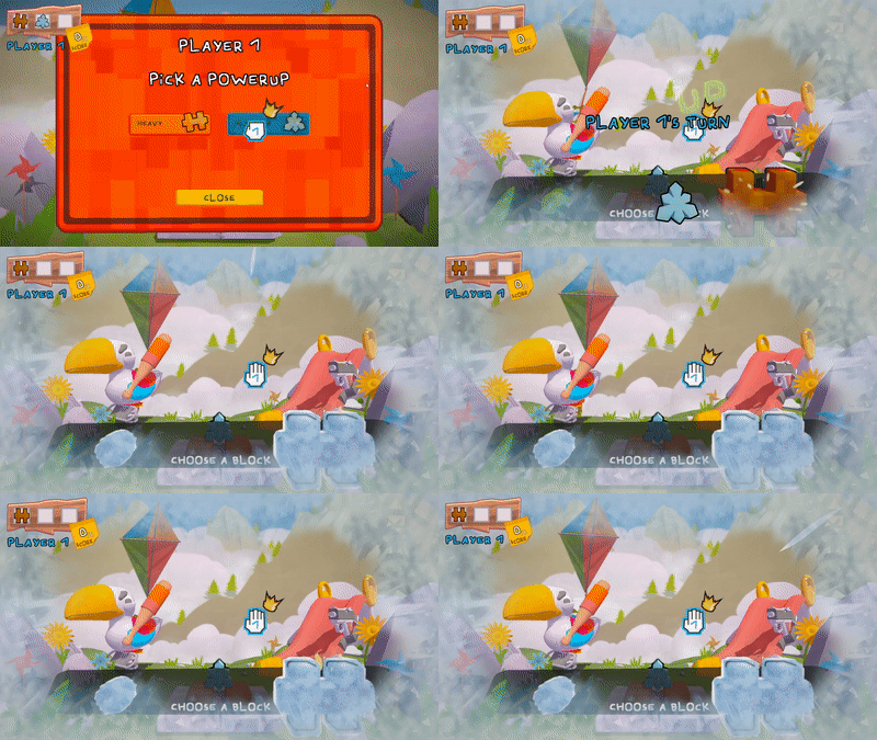
Key feedback we got was to create a stronger distinction between when it was time to pick up a block, and when it was playtime. We have done this with a strong bold shape, accompanied with some guiding text. This should hopefully help put more focus on when it's time to pick a block, and make sure that no blocks get drowned out in the kindergarten funtime happening in the background.
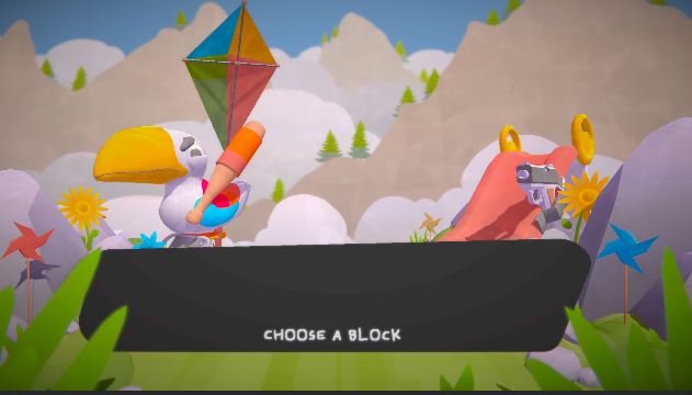
The rimlight values were a little funky and were leading to some intense light creeping on edges that noised up the gameplay more than added anything cool. These have now been tweaked, so blocks look cleaner than ever.
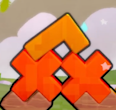
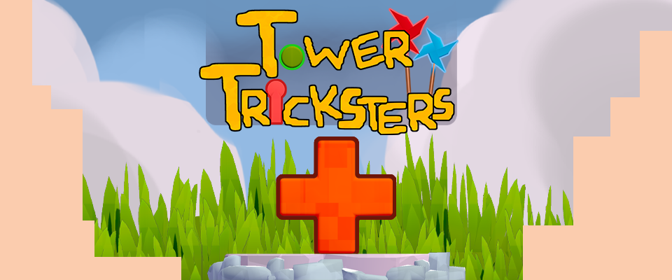
Another big push for this week was the garnish on top, the final cherry to finish the pie. We have been cooking up some tasty artworks for title screens and main title screen, so we can finally give a true identity to Tower Tricksters!
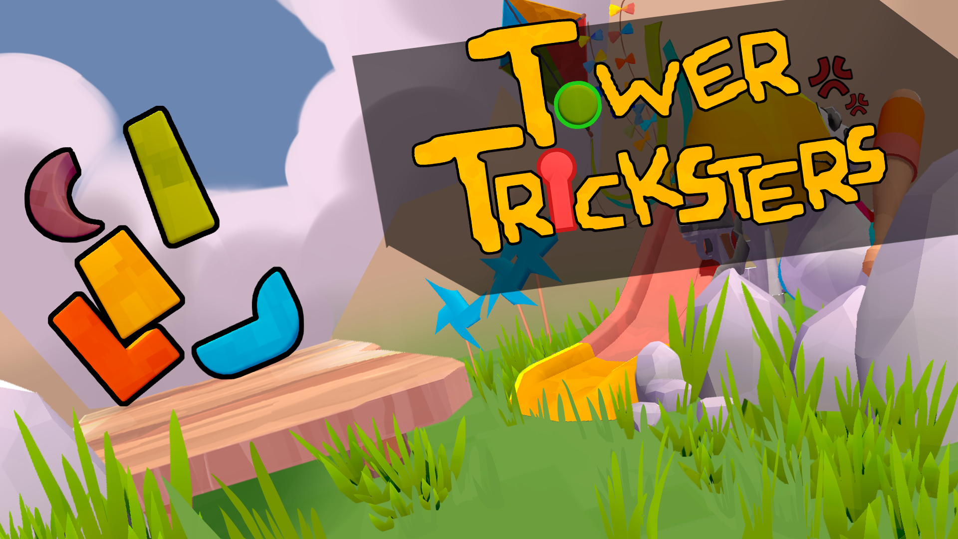
Finally giving a face and name to our game sure feels like a crowning achievement.
Along with that we have just been polishing every visual aspect of the games as best as possible. From new effects to really sell of nasty and cool powerups (that's a joke on the sticky and icy powerups, please clap) to a slight polish of the smaller environment elements.
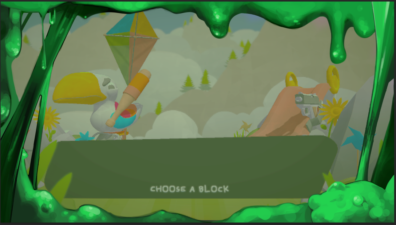
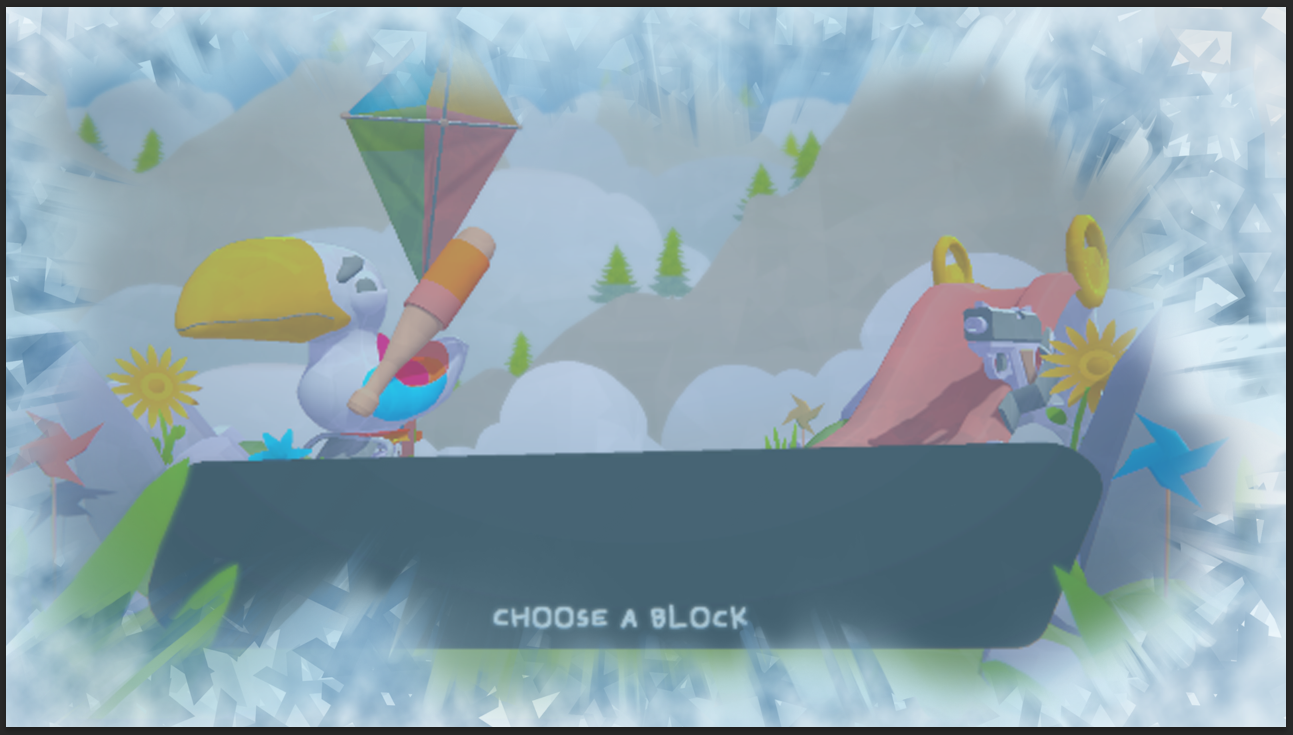
These will help the player identify when some of the most noteworthy powerups have been activated, popping up for a few seconds with a slight fade.
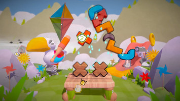
Now the groundplane isn't a simple straight groundplane, the groundplane now has a hill appearance. We created some height variation, scattered props on the sides and back of the ground plane, and added subtle color variations. We were careful not to make the middle area too busy or distracting for gameplay purposes.
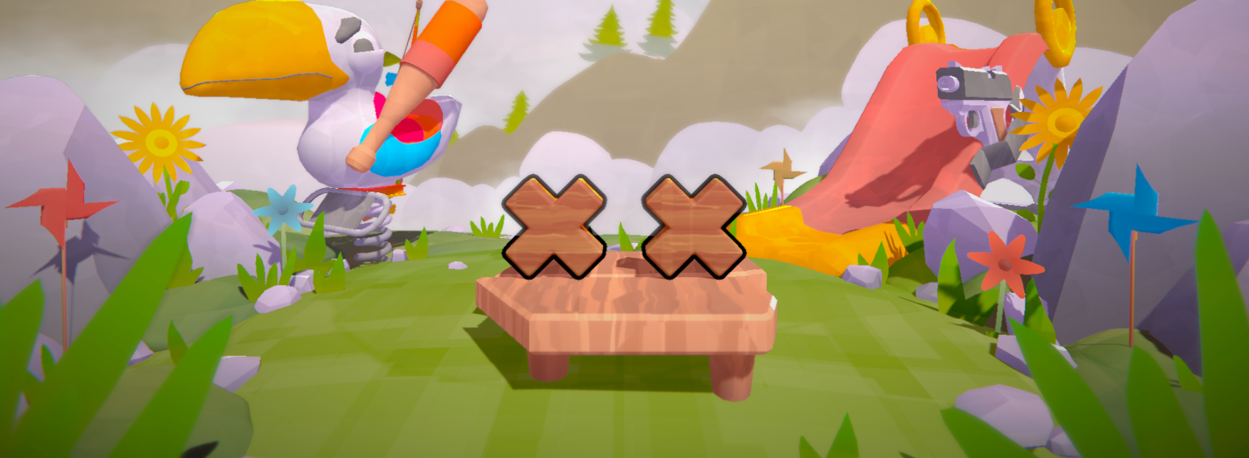
To add more life to the game, we also added animation to the clouds, giving them a gentle swaying motion. This addition of animation to the clouds makes the game feel even more alive than before, now that everything is motion.

A lot of visual improvements have been added these past few weeks but our game has never looked better. From UI to models, color popping off and polished animations everything has now come together. we can really define this a STACKING success, am i right?
In closing, additionally this week, we’ve been hard at work at cooking up a trailer for the game, BUT if youre reading this devlog, chances are you’ve already seen that! Whoa, how meta.
This is it! The final polishing features have been added to the project, so the time has come to halt production and enjoy the result. We all learned a lot about developing a game over the past few months!
This has been the final devlog - for now, we might decide to pick it back up on our own later and continue where we left off, but until then, goodbye!
Files
Get Tower Tricksters
Tower Tricksters
Mess with your friends in this colorful couch-PVP game! 1-4 players
| Status | In development |
| Authors | Mikkel Blaase, Jonathan Menschaert, samynjonas, Veehos, JohanPindeville |
| Languages | English |
More posts
- Devlog #10 - PolishMay 22, 2023
- Devlog #09 - Feature FreezeMay 15, 2023
- Devlog #08 - Updating SystemsMay 08, 2023
- Devlog #07 - Adding UIMay 01, 2023
- Devlog #06 - Powering upApr 25, 2023
- Devlog #05 - In ProductionApr 17, 2023
- Devlog #04 - Starting ProductionMar 27, 2023
- Devlog #03 - Finalizing PrototypeMar 20, 2023
- Devlog #02 - Project PrototypingMar 13, 2023
Leave a comment
Log in with itch.io to leave a comment.