Devlog #09 - Feature Freeze
Hello everyone!
We are at the end of the second production sprint, which in this case also means a feature freeze. All features that did not make it into the game cannot be implemented anymore.
This also marks the start of the final phase of production, the polish sprint, but more on that later, let’s first dive into what we did over the last week.
Programming
After a playtesting session last week, the developers focused on adding the last features and gameplay changes into the game, as well as fixing a few dozen bugs.
The players now have a limited time to place their block, after which the block will simply drop. We made this change to make the game a bit more fast paced. Before you could take all the time you wanted to calmly place down a block in the ideal spot, but now you have to keep calm and think quickly if you want to have a successful turn.
The timer that indicates how long the tower needs to balance now actually stops ticking when the tower moves too much. It happened too often that the tower was falling, but the player in the next turn got points deducted for it instead because it hit the ground just after the timer was finished. While we have not completely prevented this from happening, it should happen a lot less now.
We also changed the win and lose condition. Before you would be out of the game if your score reached zero, but since you also start out with zero, it was very easy to lose on the very first turn of the game. We were aware of this issue for a while already, but it took a while to come up with an appropriate replacement that fit with the theme of the game. So, this is how it works now:
We divided the game up into rounds. How many you ask? As many as you want! A round is decided by reaching a set amount of points as first player. Every round you decide to play, the amount of points needed increases and the tower of the previous round locks in place, which makes every round unique and harder than the last, as you can still lose points from the round before.
When you decide to end the game, the player with the most points at that moment wins the game.
UI
We are JUST in time for the last update on the UI. The last bits and bobbles are in place, everything is nice and colorful, blocky and square-y and ready to be polished up to a satisfying degree. The last stretch will be just relaxing, fixing backgrounds and doing a nice start screen. We have some tasty splash art planned for that.
For the UI we on the artsy side of things focused on those key visual aspects that were core of our game: simplicity and readability, but in a fun way.
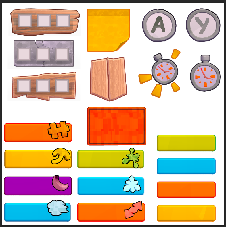
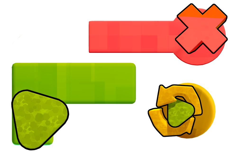
We now have every element to assemble a sensible UI for end production. From HUD in TWO materials (oh, the luxury) scoreboards, timers et cetera et cetera.
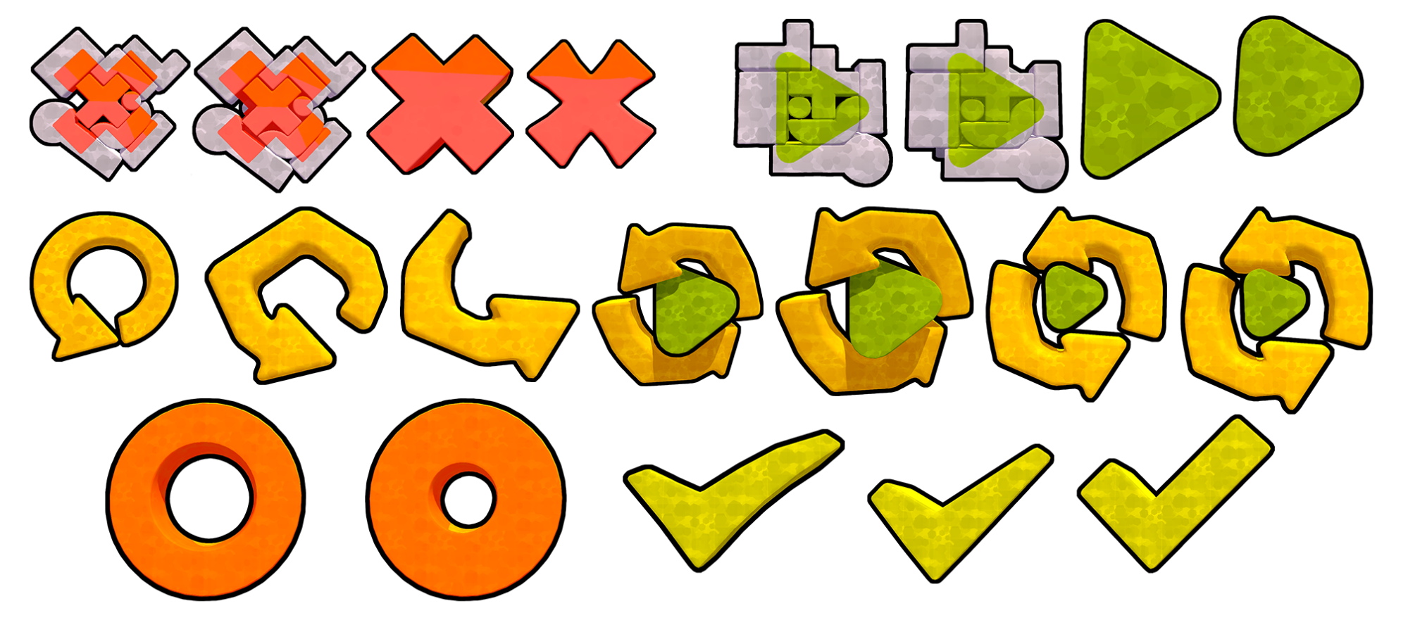
We also have icons for everything! (We had those last week too, but they were still a secret).
Each powerup has been paired to a bar of a sensible color, from slimy sticky green to freezing blue (also to be made extra sticky and icy during polish, so stay tuned for that!).
Art
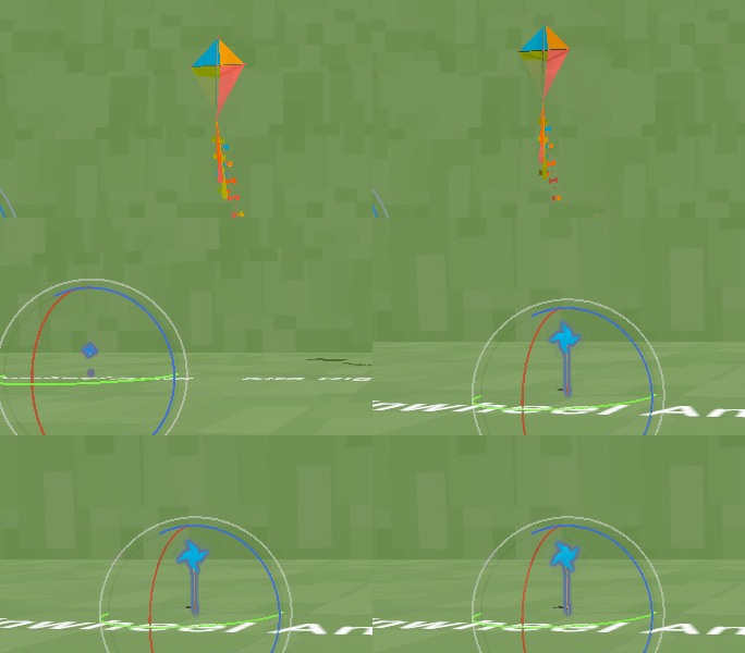
Making it JUST over the finish line before the feature freeze and joining us for this sprint will be; drumroll please, the KITE and the PINWHEELS. (confetti). These boys will be sure to be as wonderful of a fidgety toy for idle players, as the Toucan and Gun-slide are proving to be. Check out and ideation of how they act when interacted with, and enjoy this delectable screenshots of their in-game positions, tying into the next point of discussion!
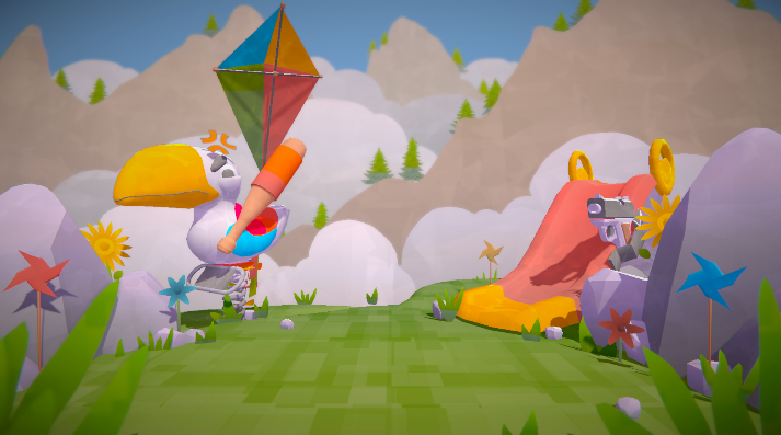
We’ve setdressed a ton, and set up a post processing stack, to really add onto the oomf-y delicious game feel we are working towards.Check out this picture of last weeks game scene for comparison. Sheesh, talk about a glowup?
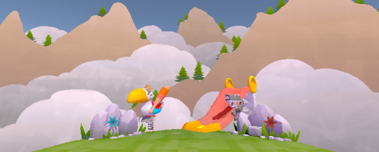
Now, the keen observer might be noticing the elephant in the room. Where did the pixelation go? To keep everything short, we will be saying our soldiers salute to the pixelation shader. We really did try to make it work, but it really didn’t do us any good, and turns out, having hefty pixelation on a pixel perfect balancing game, is more frustrating for clarity than it does any good.
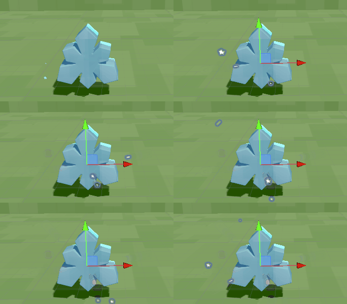
During player testing we also noticed that people were having a hard time knowing if a block would hold a super cool powerup, or be a lame basic block, so we added a little extra spice to hopefully sell players on realizing that a block was more special than others with a particle system.
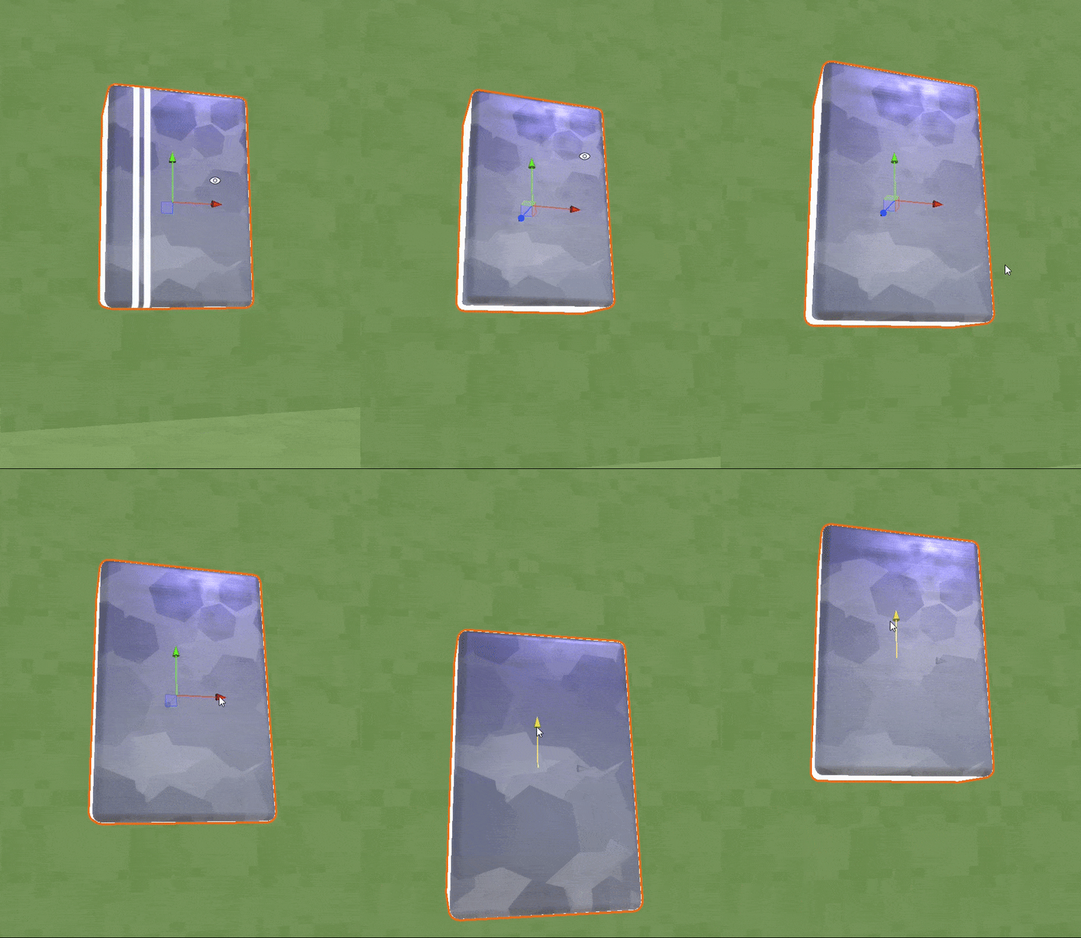
We created a shader material that has the look of metal. It is supposed to be very heavy . The metal will then be used as a Power-Up.
As mentioned in the intro, we now enter the last phase of production: the polish sprint.
No new features can be added here, but the existing ones can be “polished”. This means that in the coming weeks, we will be spending time updating several art assets and scripts to bring the game to the next level.
Get Tower Tricksters
Tower Tricksters
Mess with your friends in this colorful couch-PVP game! 1-4 players
| Status | In development |
| Authors | Mikkel Blaase, Jonathan Menschaert, samynjonas, Veehos, JohanPindeville |
| Languages | English |
More posts
- Devlog #11 - Finalizing ProjectMay 30, 2023
- Devlog #10 - PolishMay 22, 2023
- Devlog #08 - Updating SystemsMay 08, 2023
- Devlog #07 - Adding UIMay 01, 2023
- Devlog #06 - Powering upApr 25, 2023
- Devlog #05 - In ProductionApr 17, 2023
- Devlog #04 - Starting ProductionMar 27, 2023
- Devlog #03 - Finalizing PrototypeMar 20, 2023
- Devlog #02 - Project PrototypingMar 13, 2023
Leave a comment
Log in with itch.io to leave a comment.